It’s no surprise to hear that Amazon dominates the e-commerce market, but their true grasp on the industry is staggering. According to data firm Slice Intelligence, Amazon accounted for 43 per cent of total US online sales in 2016, with this figure on course to reach 50 per cent in 2021. Squeezed retailers are increasingly looking at innovative ways to improve the customer experience and compete in this intensely crowded online environment.
Many e-tailers have begun to turn their attention to website designs that focus on ease of use and simplicity, eschewing long-held beliefs of what an e-commerce website should look like.
“For some time, the accepted wisdom among e-commerce retailers was that a grand online offering, encompassing all manner of features and product versions, was the only route to success. Yet these websites invariably fall short of these lofty expectations due to the immense pressures involved in maintaining a fast, responsive experience that matches the pace of customer demand, particularly where the mobile experience is concerned,” says Perry Krug, principal architect at database provider Couchbase.
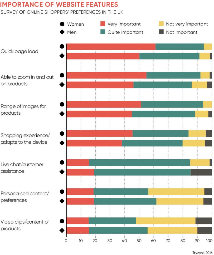
Digital performance company Dynatrace found that UK retail sites, which do not eliminate unwanted, data-heavy features, risk turning customers away. A Dynatrace report revealed that retail websites in the UK took 25 per cent longer to load in 2016 than they did in 2015, up from an average response time of 2.9 seconds to 3.7 seconds. While a 0.8-second increase may not seem all that dramatic, it does become a major issue when a 0.5-second rise in load time leads to an 11 per cent reduction in site conversion rates.
David Bloy, director of web design agency Bluebox, says his clients are clearer than ever that the website they are commissioning is there to do a job rather than be an artistic expression. “Of course, design is still incredibly important, but what we are seeing is web design aligning itself more with a discipline like product design, where the design aspect is integrated with function rather than being merely decoration,” he says.
Much research has been done to uncover the psychology of the online shopper and to find out exactly what they want to see on e-commerce sites. By using techniques at the testing stage, such as eye tracking, where a sensor measures exactly where on the screen a user is looking, retailers can discover what works. The results of these tests clearly show what viewers are drawn to and make removing unnecessary content easier, allowing negative space to frame the most important information.
Bricks-and-mortar retailers aren’t able to just duplicate their in-store experience to the digital environment. “When somebody walks into a physical shop they are in the mood to buy, closing the deal is easy. Online retail is different in that you have to build the desire to purchase over a much longer and much more complicated journey. People rarely impulse buy online, they will do their research first,” says Andrew Larking, creative director of digital agency Deeson.
However, the same approach to behavioural psychology can often be translated successfully to a retailer’s e-commerce platform. Placing high-margin items to the left of the main entrance, when most people walk into a shop and look left, is an effective way high street stores use psychology to nudge shoppers into purchasing. Featuring just a few leading products on an e-commerce home page and removing clutter can lead the customer into the desired conversion path, creating the same nudge effect physical shops produce.
When we create designs that clearly signpost what we want users to do next, they are much more likely to do it
Personalisation technologies help to scale down choice and present only the most relevant content to customers, leaving e-commerce websites free from trivial content that damages the customer experience. But it’s vital for retailers not to rely overly on hyperspecific customisation, as tracking systems and psychometric profiling can only go so far.
“When they fail, they really fail,” says Mr Larking. “People don’t like to feel pigeon-holed and online retailers that give incredibly targeted ads and product suggestions often feel creepy, and more often than not get it wrong. This can have a negative impact and erode the value of the brand.”
Simplicity in e-commerce design is in part driven by the increasing amount of research which clearly indicates that visually complex websites are viewed as less attractive than simpler ones, but the growth of mobile shoppers is also pushing retailers to consider pared-down e-commerce sites.
“It is stating the obvious, but mobile devices simply don’t have the screen space of desktops. For us as web designers, that means every element of a design needs to earn its place. That alone drives you down the route of simplicity over complexity,” says Mr Bloy at Bluebox.
There are legitimate concerns over simple e-commerce designs, which some retailers fear may strip away the personality of the website or make it more difficult to differentiate themselves from competitors. However, as long as these e-commerce designs are still able to express the core values and product offerings of a brand, then less is certainly more in this case.
“We have seen it ourselves that simpler designs work better. When someone on a web page is offered a whole host of options – ‘click here’, ‘download this’, ‘sign up now’ – the result can be choice paralysis. On the other hand, when we create designs that clearly signpost what we want users to do next, they are much more likely to do it,” Mr Bloy concludes.