A striking and compelling logo that includes distinctive assets such as images, colour and typeface is essential in building a brand.
Mondelēz, the American confectionery company that owns Toblerone, would do well to remember that as it prepares to redesign the Swiss chocolate brand’s iconic Matterhorn emblem later this year.
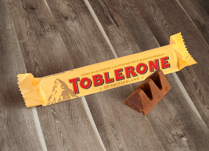
Since 1970, Toblerone has featured the silhouette of the 14,690ft-high Alpine mountain – which also inspires the distinctive triangular shape of the chocolate itself – on its packaging. And in 1990, the British artist Andrew Davidson cleverly incorporated a smaller silhouette of a bear (the mascot of Switzerland’s capital city, Bern) into it.
Together with Toblerone’s bold red-and-yellow colour scheme, the Matterhorn logo completes a masterpiece of marketing design that takes pride of place in many airport duty free shops around the world. It also helps that a blend of milk chocolate, honey and almond nougat is absolutely delicious.
Why is the Toblerone logo changing?
But, as Mondelēz has taken the decision to move some of Toblerone’s production away from Bern to Kostolné Kračany in Slovakia, the famous logo will be forced to change.
A striking and compelling image-typeface combo is essential in building a brand
Legislation set out by The Swiss Federal Institute of Intellectual Property mandates that only brands that satisfy certain manufacturing criteria can use the categorisation ‘Swiss-made’ and/or use the country’s flag for marketing purposes. According to the government agency, this is to ensure the long-term value of and encourage sustained investment in domestic products. The legislation also extends to indirect national symbols, such as the Matterhorn. Its position on the bear is unclear.
Mondelēz, then, must tread carefully. Designing a new logo requires skill, sensitivity and self-awareness. The consequences of getting a rebrand wrong can be severe.
Never underestimate how much logos matter
In 2009, Tropicana changed the logo and packaging of its flagship orange juice product. It traded its iconic dark-green sans-serif typeface curved over the top of an accompanying image of an orange with a straw sticking out of it, for a light-green font that read vertically down the side of the carton.
Designing a new logo requires skill, sensitivity and self-awareness
The main image on the new packaging was not an orange, but rather a glass of juice. The orange lid was replaced with a lid in the shape of an orange. The ‘100% Orange Juice’ tagline was also replaced with a new one: ‘Pure premium’.
In the two months following the launch, which critics suggested had made Tropicana look like a generic, in-store brand, the company’s sales dropped by 20%. Tropicana ditched the logo and reverted to something similar to its previous design shortly after. It is estimated that the rebrand and drop in sales cost Tropicana somewhere in the region of $50m.
In 2010, when clothing company Gap revealed a new logo, the reaction was even worse. The company traded a navy-blue square featuring its fully capitalised name in a tall, imposing white serif font, for a much smaller, lighter blue box accompanied by a bland, black Helvetica typeface with two lower-case letters.
The new Gap logo is thought to have cost the company around $100m. It was pulled and replaced with the old design after just six days.
What will the new Toblerone logo look like?
In a statement, Mondelēz told the Swiss newspaper Aargauer Zeitung that the packaging redesign will introduce a “modernised and streamlined mountain logo that aligns with the geometric and triangular aesthetic.”
It is a relief, at least, that it isn’t messing around with the triangular shape.
The consequences of getting a rebrand wrong can be severe
Mondelēz added that Toblerone packaging will now read, ‘Established in Switzerland’ rather than ‘Of Switzerland’ and feature the signature of the chocolate’s original founder Jean Tobler.
Mondelēz has explained that its moving Toblerone to Slovakia is in response to the growing worldwide demand for the product. The cheaper cost of manufacturing in eastern Europe, it said, would allow it to make “millions of additional bars”.
Be that as it may, as the cautionary tales of Tropicana and Gap teach us, sales will suffer if people don’t like what they see on the shelf.
Toblerone has built a connection with consumers, based on its strong Swiss identity evoking artisan chocolatiers and impressive mountainscapes. The quirky conversation starter of the bear hidden in the Matterhorn, too, has helped make the brand more memorable.
Mondelēz must think long and hard about how to recreate that same sense of prestige, intrigue and history under the new constraints. My advice? Don’t try to be too radical and don’t lose the bear.
A striking and compelling logo that includes distinctive assets such as images, colour and typeface is essential in building a brand.
Mondelēz, the American confectionery company that owns Toblerone, would do well to remember that as it prepares to redesign the Swiss chocolate brand’s iconic Matterhorn emblem later this year.
Since 1970, Toblerone has featured the silhouette of the 14,690ft-high Alpine mountain – which also inspires the distinctive triangular shape of the chocolate itself – on its packaging. And in 1990, the British artist Andrew Davidson cleverly incorporated a smaller silhouette of a bear (the mascot of Switzerland’s capital city, Bern) into it.
