For a non-disabled person, opening a tightly wrapped cardboard box might require effort. For those with reduced dexterity, it’s more than a nuisance, it’s impossible.
Those who are fully sighted also take for granted the ability to distinguish between two identically shaped bottles that feature different labels, while those who are visually impaired will struggle.
Scope estimates that a fifth of the UK population, 13.9 million people, are disabled, while the World Bank reports that one billion worldwide have a disability.
Depressingly, people design for the majority because they want to reach scale and sell as much as possible
But despite the number of people requiring accessible packaging, most products rely on consumers having full sight and both hands. So why is this demographic being ignored?
Sean Thomas, executive creative director at design consultancy Jones Knowles Ritchie, thinks that marketing still caters for the masses, because it is so money driven. “Depressingly, people design for the majority because they want to reach scale and sell as much as possible,” he says.
Sam Latif, company accessibility leader at P&G, who is blind herself, adds that there is “ignorance and a lack of awareness” in companies as often decision-makers do not experience the effects of disability first-hand.
Considerations such as sustainability receive more attention as they feel like universal issues, says industrial designer Solveiga Pakstaite. “Not everyone is disabled, whereas people feel sustainability is something they can relate to, so there are more people shouting about it,” she says. But those championing inclusive design believe it should be treated with the same importance.
What is inclusive design?
Its ethos is that products, systems and environments should be designed to be used by as many people as possible, regardless of disability, age, gender or other demographic. The idea is, if you make things accessible for disabled people, you automatically make things easier for everyone.
Some projects have sprung up that include, rather than exclude, the disabled community. Microsoft’s Xbox Adaptive Controller, launched last year, is a handset aimed at disabled gamers and those with reduced fine motor skills. The controller is customisable, so assistive aids can be attached to let people play video games without using the standard buttons. Its packaging was also designed to be intuitive and easy to open, while providing a delightful unravelling experience, according to Kevin Marshall, creative director of design at Microsoft.
“It was about empowering gamers with limited mobility and creating an unboxing experience they can navigate, so they can kick off into gaming confidently,” he says.
Easy-open mechanisms
The box, which was tested with disabled gamers, features many mechanisms, including loops that can be pulled with one hand causing it to pop open, hinges and a slide-out controller tray. It has no plastic wrapping or twist ties holding the controller in.
“There are four different ways to remove the product from its tray, including shaking it out,” says Mr Marshall. “With accessible packaging, you want to give the customer options and design as many routes as possible. Users should interact with the product on their own terms.”
To protect the product, cardboard air cells were fitted, which pop out when the box is opened, avoiding the need for non-recyclable, plastic bubble wrap.
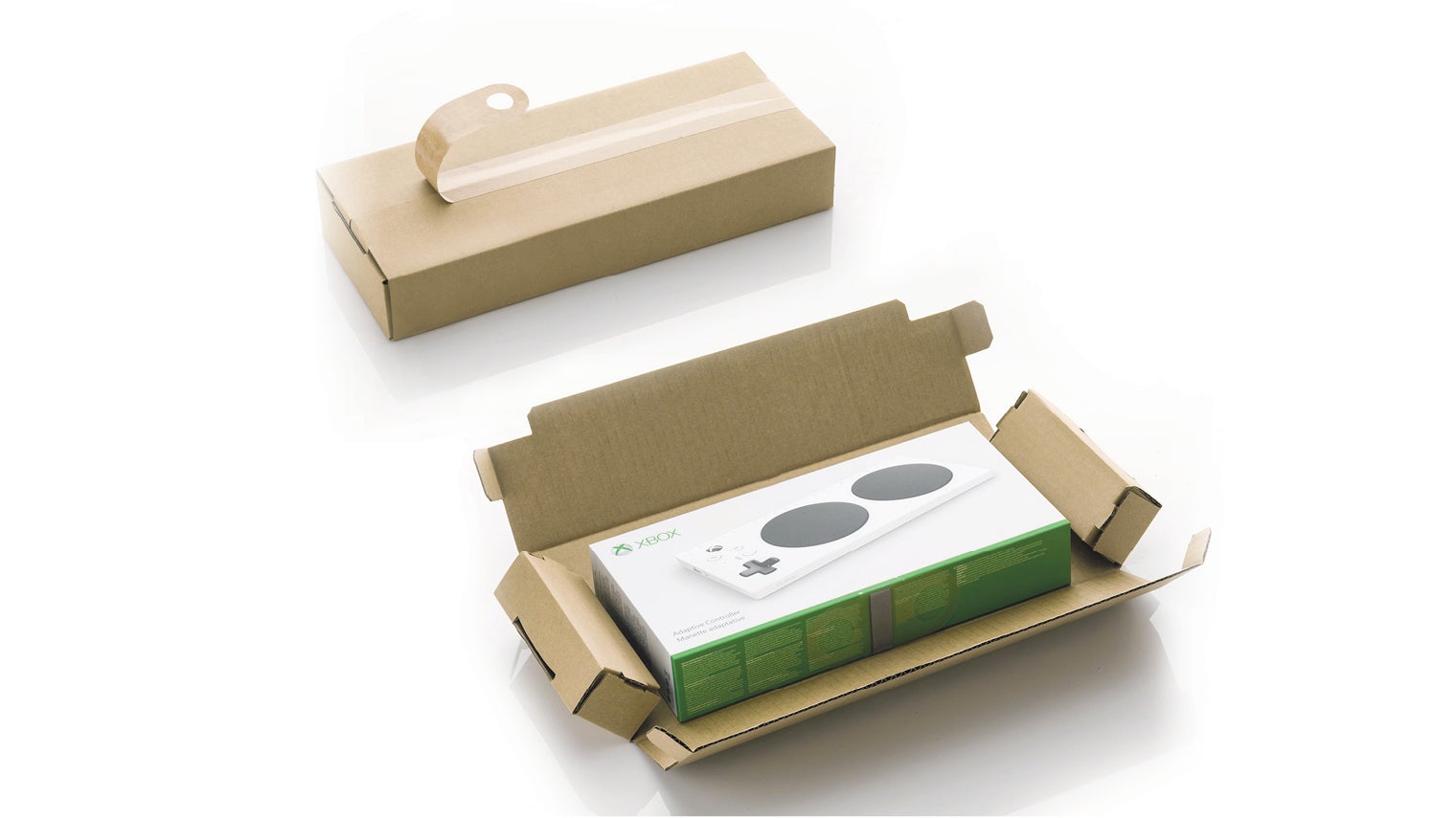
The Microsoft Xbox Adaptive Controller is aimed at disabled gamers with reduced fine motor skills and comes in easy-to-open packaging with hinges so it pops open
Using touch to tell when food is off
Projects like this show how inclusive design and sustainability often go together. Another example is Mimica Touch, a tactile expiry date made of a biodegradable gel, which feels smooth to touch when food is fresh and bumpy when it is bad. The company has two purposes: to enable visually impaired people to know when food is out of date and limit food waste for everyone by providing more accurate predictions.
The gel is kept in a little pouch on packaging and is calibrated to go off at the same speed as different foods, such as meat, milk or cheese. It reacts to temperature, so mimics food’s degradation, and is made from a waste product, making it sustainable.
Company founder Ms Pakstaite, who is currently taking Mimica Touch to market, says the tactile marker would be used alongside existing use-by dates, which tend to “err on the side of caution”. The Waste Resource Action Programme (WRAP) predicts that 60 per cent of the UK’s food waste could be avoided.
“If someone is visually impaired, then printed dates are of no use,” she says. “My research found that they were less likely to buy fresh food, as processed foods do not carry the same risks of food poisoning, so this impacts their health.”
Ms Pakstaite says that gathering diverse testers with a range of disabilities is key to inclusive design. “We call these ‘expert’ or ‘extreme’ interviews,” she says. “You learn much more from these people. If you make it easier for them, you’ve taken care of other people too.”
Using symbols, rather than braille
P&G’s Ms Latif also follows the principle of designing for everyone. Last year, she relaunched Herbal Essences’ bottles featuring tactile marks that help blind people distinguish them by touch, stripes on shampoo and circles on conditioner. A simple code like this is better than using braille, she says, which can take years to learn and is not used by all blind people, while shapes are accessible to everyone.
The marks also help anyone who wears glasses or contact lenses and has blurry vision in the shower. “Until now, packaging has been dependant on vision,” she says. “We need to think about how to bring in other senses to enhance user experience.”
To do this, brands need to build empathy internally and emulate experience, she says. At P&G, she asks staff to wear glasses that mimic sight loss then interact with products, to help them understand their accessibility. Simple tests are also conducted, such as whether something can be opened with one hand or identified by touch with both eyes closed.
Legibility and high-contrast graphics
Some designers are still focusing on how to make packaging as visually clear as possible, given that many sight impaired people are not fully blind. Certain graphic design features can increase legibility, says Mr Thomas at Jones Knowles Ritchie, such as high-contrast colours, sans-serif typefaces in large font sizes, and shapes.
This idea formed a food packaging concept, which the design studio has developed alongside Revolt Communications. Vision 20/20 is a set of packets, which are black and yellow, feature large Helvetica font and use shapes, such as circles and triangles, to indicate different foods. The shapes are easier to spot on the shelf or in a dark cupboard, says Mr Thomas, and could be used as “giant QR codes”, so they would be scanned into an app that would read out information.
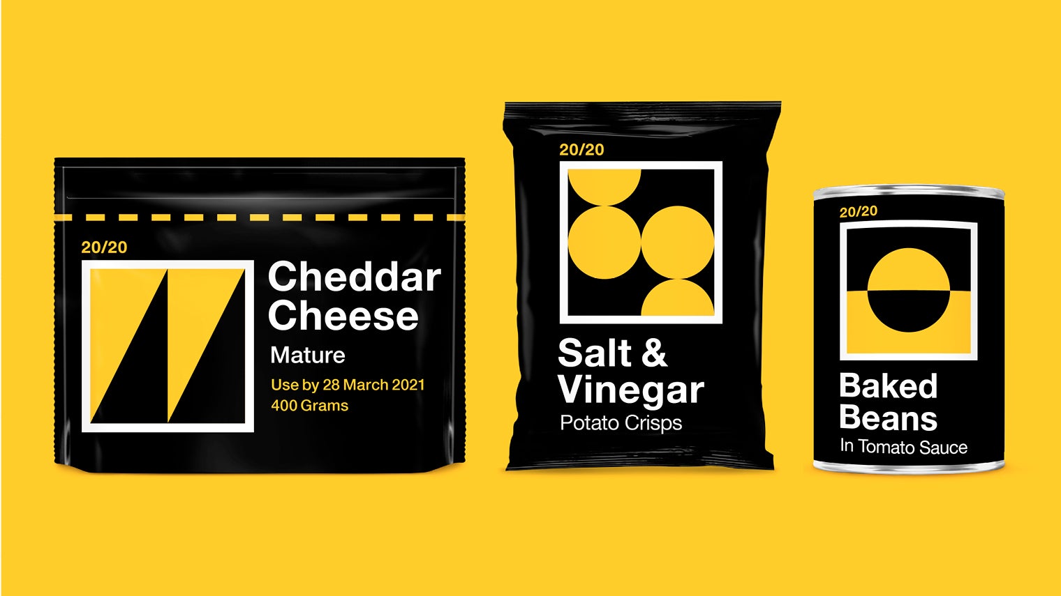
Vision 20/20, by design studio Jones Knowles Ritchie and Revolt Communications, is a set of packets that feature large font and bold shapes that are easy to spot on the shelf or in a dark cupboard
Looking forward
Ms Pakstaite believes packaging will become more inclusive as it becomes more sustainable. “When it’s not seen as disposable, it will become more valued,” she says.
Microsoft’s Mr Marshall thinks there will be better use of visual recognition software that uses artificial intelligence to narrate the world around us. While Ms Latif hopes to see simple changes made to physical packaging that could make a big difference to many people, including non-glossy packets, the ability to open things with very little force and using more images, which would help those with learning disabilities.
“A small picture of a shower could feature on a shampoo bottle,” she says. “We’re an emoji culture now and we can use them to help people understand how to interact with products.”
While there are seldom examples of inclusive design in packaging, these projects show there is potential in making everyday items accessible to different demographics. Whether used for baked bean tins or high-end gaming kits, the main point is that inclusivity should not be tagged on to the end of the design process, but embedded from the start.
What is inclusive design?
Easy-open mechanisms


