A great online experience means visitors can find the information or products they need easily, whatever device they use and with the minimum of hassle.
This is also about retention. It can cost up to seven times more to acquire a new customer than to keep an existing one, so a focus on customer experience can pay off over time.
The flip side is that it can be very easy to deter website visitors with frustrating experiences. Sites still make some very obvious mistakes in this area.
As print advertising revenues have dropped, online advertising has not taken up the slack, leaving many publishers with a gap in their finances. This has led some sites to use evermore intrusive ad formats to increase revenues.
There’s nothing wrong with advertising, but intrusive ads which take over the screen, videos that play audio automatically and low-rent content recommendations all have the potential to deter visitors.
 Many users have responded to ads by installing ad-blocking software. According to the Interactive Advertising Bureau, 21 per cent of UK adults used an ad blocker in July 2016. Others will just leave the site if advertising annoys them.
Some sites have more ads than content and, with plenty of competition online, there’s a real risk that chasing ad revenue will deter traffic in the long term.
According to comScore, mobile devices now account for two of every three minutes spent online, so a mobile website is essential.
Many brands now have mobile sites, but some have yet to catch up. For example, Playmobil just has a desktop site, meaning mobile visitors will struggle to read and navigate through the site without a lot of effort.
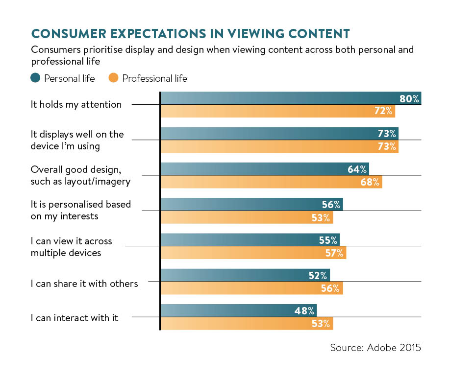
People make snap decisions about a site once they arrive. They need to be able to trust it and find what they need easily. It’s a subjective judgment, but if users feel the site looks unprofessional, then they’ll just click away and find an alternative.
A survey from Adobe found that 38 per cent of people will stop engaging with a website if the content or layout is unattractive. Design matters.
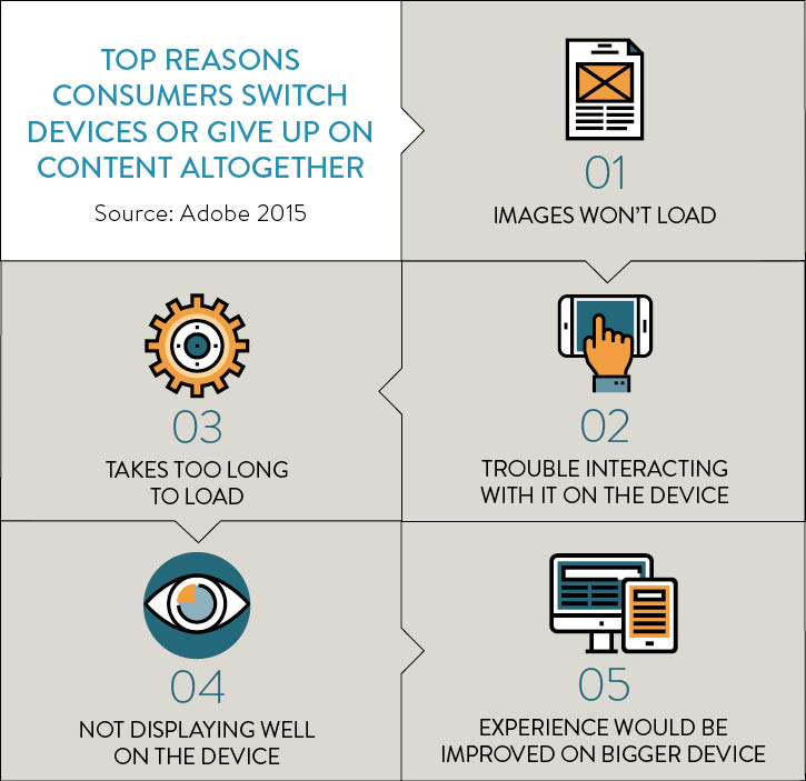
Broadband speeds have improved in the last few years, as has mobile internet access, with 4G more common. There is now very little excuse for slow loading sites.
Slow sites frustrate users and lead directly to lost sales. Google says 40 per cent of consumers will leave a page that takes longer than three seconds to load.
Making it accessible
Accessibility is about ensuring that your website can be used by disabled visitors.
The Global Economics of Disability Annual Report 2014 estimated the global population of people with disabilities at 1.3 billion. This equates to almost 18 per cent of the world’s population or one in five people. With a combined disposable income of more than $1.2 trillion, it’s a significant market to exclude.
Many companies are making basic errors which limit the accessibility of their sites. For example, a recent travel accessibility report by Sigma claimed that both British Airways and Co-operative Travel had a lot to do to improve accessibility.
For e-commerce sites, the checkout process is the single biggest source of frustration for users and one particular potential barrier to purchase is registration.
Many companies are making basic errors which limit the accessibility of their sites
According to statistics from UK firm SaleCycle, having to create an account is the second biggest reason for abandonment of shopping sessions.
Registration is a problem for many shoppers as it seems like extra work for them to do before making a purchase and represents a level of commitment that not all visitors want to take.
It used to be common practice for retailers to ask customers to register and create an account before going on to pay for items. Some, such as Boots, still insist that customers register, but the answer for many retailers has been the introduction of guest checkout. This encourages more people to go through the payment process, while the option of creating an account can be offered at a later stage.
For example, ASOS removed its registration option and reduced checkout abandonment rates by 50 per cent.
Online shoppers want to know the costs of their purchase upfront, so retailers should be very clear about total product and delivery charges before customers enter payment details.
Even Ryanair, infamous for the pre-ticked boxes on its website for extras such as insurance, has cleaned up its act online in response to user frustration. There are still sites that do this though, such as ticketing sites which add inexplicable processing fees on to the cost of tickets.
It’s an approach which may increase revenues in the short term, but if you are seen to be deceiving users, it’s a poor long-term strategy for customer retention.
No shortcut to customer trust
We’ve come a long way from the early days of online retail, when shoppers were yet to be convinced about the security of their payment details, but some customers are still wary.
There is no shortcut to earning customer trust. It comes from a mixture of brand recognition, the look and feel of a website, security reassurances and factors such as positive reviews.
Clear contact details also build confidence in users. KoMarketing found that 44 per cent of visitors will leave a company’s website if there’s no contact information or phone number.
Websites have a short time to convince visitors to stay, and a common problem for websites is a failure quickly to convey to visitors what their product or service does – the value proposition.
This can be more of an issue for business-to-business companies, where products and services are often more complex, requiring greater explanation. Visitors need to know how the product or service can help them, the value it delivers and what it offers compared to the competition.
A frustrating experience when completing forms online is a common reason for customers to abandon a website. Information such as address and payment details is required, and it’s important to make data entry as easy as possible.
Common problems include asking for too much or unnecessary information, confusing form fields and unclear error messages. For example, Boots requires passwords in a certain format, but doesn’t explain this until users make an attempt to create one.
Top image: Online fashion retailer ASOS reduced checkout abandonment by 50 per cent by removing its registration option.
