Porto, the historic second city of Portugal, is hot property. Tourists flood its streets and construction cranes line the skyline. For three of the last six years, visitors have voted the city best European destination.
The most difficult thing is translating an abstract idea into something visual
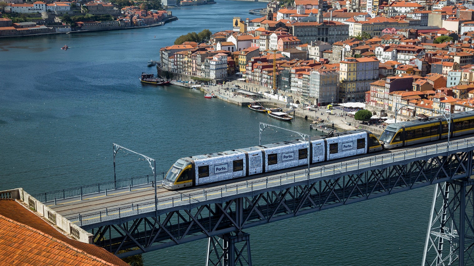
Its success comes with an innovative city rebranding that sees the same eye-catching imagery plastered on everything from municipal buildings and building sites to dustcarts and police motorbikes.
City branding is a multi-billion-dollar business, but striking a distinctive note that fires people’s imagination and sets a place apart is no easy task. So how did Porto pull it off and what might others learn from its experience?
How designer Eduardo Aires reimagined Porto
The man to ask is Porto-based Eduardo Aires, a multi-award-winning designer and founder of the boutique design consultancy White Studio. In June 2014, he won a three-agency race to create a new identity for this riverine city famous for its eponymous port wines.
The brief from City Hall was relatively straightforward: come up with something that encapsulates the character of the city and its people, while also signalling the municipality’s portfolio of services.
“The most difficult thing is not representing the city by an icon or something physical. It’s more translating an abstract idea into something visual; that’s the most difficult thing,” says Mr Aires.
His eventual solution comprises a family of simple yet bold images that depict the city’s unique gastronomic, architectural, cultural and geographical elements. Overlaying this suite of images is a grid structure that helps frame how they are presented, as well as elucidate the inter-relationship between the different themes.
Pulling the whole branding exercise together is the name of the city, reinforced by a dot. Mr Aires admits to phonetic good fortune. Orally, the word “Porto” is not only short, but it lends itself to forceful pronunciation. As he notes: “It would be harder if it were Marinha Grande.”

Eduardo Aires says consistency is key to city branding
What the new city branding has done for Porto
Since its rollout five years ago, Mr Aires’ PORTO. concept has turned the city’s identity on its head. Its influence affects how residents perceive the place where they live as much as it does how tourists view the destination they have paid to visit.
A recent opinion survey carried out by Pedro Quelhas Brito, a professor at Porto University’s economics faculty, found that 22 per cent of respondents say the logo gives a sense of unified organisation. A further 17 per cent connected the descriptors “innovative” and “futuristic” to the design.
For Porto-based hotelier and former interior designer Juan de Mayoralogo, the identity of the city is now much more uniform and easy to recognise. “The city’s branding has moved Porto towards a feeling of modernity that many other major European cities don’t have,” he says.
Eduardo Aires’ design tips for city brands
When it comes to advising other designers, Mr Aires, who is now invited to give lectures around the world, has three main tips. The first revolves around striking an authentic note. Slick and smart as many city brands are, there is a generic quality to many that gives them a sense of interchangeability.
The key word for Mr Aires is “territory”. Every city has a unique cultural, geographic and architectural landscape. Unless this can be identified and brought to the fore, then the result will be a wishy-washy banality, however hip the actual design.
His approach, therefore, is to involve as many people as possible, who know and love the city, in the concept stage. To this end, he favours working with interdisciplinary teams, frequently drawing on input from poets and artists through to geographers and sociologists.
“In the case of Porto, we put ourselves as observers of our territory and we got out of the inner circle so we could see the city from the outside,” he says.
Mr Aires’ second word of advice centres on the need for consistency. Before the PORTO. visual identity, the city’s branding was characterised by a hotchpotch of logos, crests and lettering. For the new design to really hit home, he told City Hall that any legacy imagery had to be binned.
The municipal authority listened. Not only did it erase all traces of its previous branding, it rolled out Mr Aires’ new city identity universally. To ensure consistency, his studio produced a style guide for the dozens of other designers working for City Hall. The document serves as a manual on the dos and don’ts of using the PORTO. palette of colours, fonts and icons.
The new identity was rolled out universally, and legacy logos were scrapped
How designers can become branding strategists
His final piece of advice relates to implementation. Habitually, design teams are called in at the beginning of a city branding exercise, they put together their solution and then walk away. Job done.
Not so in Porto’s case. Despite signing off the initial proofs back in 2014, Mr Aires has remained closely involved in the design’s evolution and implementation. Shifting from a pure graphic designer to something closer to a branding strategist, he advises the many different divisions within City Hall on general branding strategy as well as specific projects.
At present, for example, he is leading the branding of a huge redevelopment of the city’s iconic Bolhão market. The building, which stretches across an entire block, is wrapped in a colossal tarpaulin that carries the now ubiquitous PORTO. iconography.
Testament to Mr Aires’ creative vision is the number of cities around the world that have “borrowed” his PORTO. idea. Yet this isn’t what makes him most proud. That honour goes to how the people of Porto have taken to the city’s branding as their own.
Some have even had PORTO. logo tattoos. He notes: “As a brand designer, there’s no better sign of people embracing your work than that, right?”
How designer Eduardo Aires reimagined Porto
