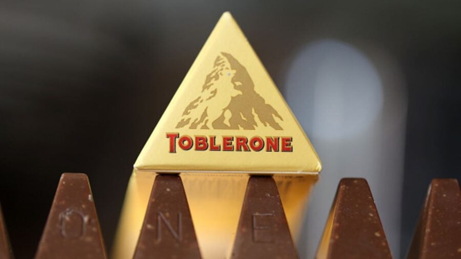
Andrew Davidson is an illustrator and graphic designer with more than 40 years of experience. He has worked with major brands including Waitrose, Bacardi and Toblerone – for whom he cleverly incorporated a silhouette of a bear into its Matterhorn logo in 1990.
Davidson, who graduated from London’s Royal College of Art in 1982, came up with the illustrations for a line of adult-version covers for the Harry Potter books. He has also produced several pieces of wall art for the All England Lawn Tennis Association and, later this year, will design the first silhouette of King Charles III for Royal Mail’s new stamps.
Here, he talks to Raconteur about the challenges of modern branding…
What’s your process for coming up with a logo? How do you start?
I work with, or have worked with, many different design groups, including Turner Duckworth, Pentagram and NB Design. Normally, one such group gets in touch with me via my agent, approaching me with a project they think I’m suited for.
There’ll be a brief which has been prepared as a result of a meeting with a client. The project might involve modernising an existing logo, or more interestingly, creating a brand new one from scratch.
Once I’ve spoken with the design group, I draw a selection of pencil ideas onto typographic paper. At this early stage, this gives me freedom to explore different approaches to the brief. These can be later reduced down to ideas which are then presented to the client for their comments and approval.
I work using traditional methods. Wood engravings, for example, produce a hand-finished look which works well for craft beers or spirits. Working with brush and ink on Bristol board paper gives a sharper, cleaner look. The work is scanned and if necessary manipulated digitally by the design group.
What’s it like working with huge organisations on such a visible part of their brand? Do you feel the pressure to get things right?
Since I’ve been working as a designer and illustrator, I have always taken the view that each job, and indeed each client, no matter how large or important, should be treated with the same amount of consideration and respect as smaller less prestigious commissions. Every business has to start at some point.
What happens if a client doesn’t like one of your designs? What happens if you don’t like their brief?
Thankfully, this doesn’t happen very often because, quite simply, if I’m not happy with the client, or indeed the brief that is proposed, there won’t be a good outcome. In any such instance, it’s best to politely decline the commission and suggest someone more suitable.
What logo do you wish you’d designed?
I am fortunate to have worked with one of the greatest graphic designers of all time, the late Alan Fletcher, who was one of the founding partners at Pentagram. Two of his designs spring to mind for their intelligence and elegance: the V&A logo for The Victoria and Albert Museum and the logo for FedEx, which cleverly integrates an arrow within the letterforms.
Is there ever a right or wrong time to change a logo?
A business has to be aware of the social and political mores of the day. Something depicted some years ago may now cause offence and not be acceptable.
In sport, for instance, the Washington Redskins changed their name and logo to the Washington Commanders to avoid further appropriating Native American culture.
What do you think the new Toblerone logo should look like?
I haven’t seen the brief but it will be difficult to achieve the instantly recognisable character of the original, which not only gives a nod to the shape of the Matterhorn but includes a hidden bear, a reference to the animal which represents the canton of Bern, where Toblerone comes from.
My advice would be to try to keep it simple. Don’t crowd the image with too many assets. Don’t veer too dramatically from what the Swiss iconography legislation still allows to be used. Toblerone is a brand that is lucky enough to have a history, so it would be foolish not to capitalise on it.
How has social media changed the branding landscape?
There is so much competition on the internet for people’s attention. Established brands have an advantage, because they have big budgets and can put themselves in the right positions.
In terms of new brands and logos, I think there is a pressure to be strategic. It’s about getting the logo seen where it needs to be seen and in front of who it needs to be seen by. In this respect, social media platforms are the new battleground for advertising.
In terms of design, that depends on the product and the company. But, again, my advice would be: don’t overcomplicate an image. It needs to be bold and eye-catching, able to cut through the noise and stand out from the crowd. The logo will need to be adapted or adjusted to appear on different screen sizes, so you don’t want anything that will make that too difficult.
Andrew Davidson is an illustrator and graphic designer with more than 40 years of experience. He has worked with major brands including Waitrose, Bacardi and Toblerone – for whom he cleverly incorporated a silhouette of a bear into its Matterhorn logo in 1990.
Davidson, who graduated from London’s Royal College of Art in 1982, came up with the illustrations for a line of adult-version covers for the Harry Potter books. He has also produced several pieces of wall art for the All England Lawn Tennis Association and, later this year, will design the first silhouette of King Charles III for Royal Mail’s new stamps.
Here, he talks to Raconteur about the challenges of modern branding…


