From colas to cosmetics and oven cleaners to crisps, brands are looking to strip their designs back to the bare essentials to stand out on shelves and on screens. Out go the daisies, sunlit fields, the ornate Victoriana, the histories of brand origin, the ostentatious logos and swirling colours that were the hallmarks of the craft trend. In come big, simple logos in bold hues with little else on the packaging to distract the eye. This is branding writ large.
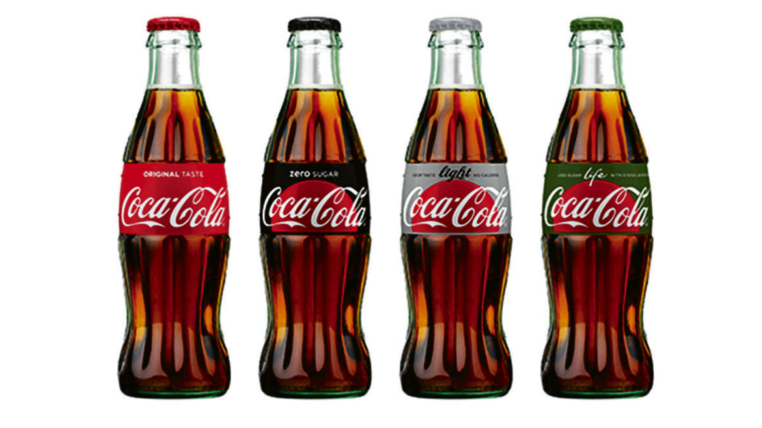
Striking examples of the minimalist trend include new designs for McDonald’s takeaway packaging, the Coca-Cola range, the Argos Simple Value range, Oxo, PG tips, Domino’s pizza and countless others.
Landor executive creative director Valerie Aurilio explains: “Design is about solving a problem and one of the biggest problems these days is that consumers are inundated with information. People are looking to declutter, they are looking for simpler choices, they are overwhelmed by everything they are seeing on shelf and online. It behoves brands to become easy to choose, easy to shop and a simple pleasure.”
She says brands which relaunch with minimalist designs can struggle to achieve this. But brands such as Method, Eos and Nivea, which were originally launched with a minimalist design, are far more successful.
Avoiding risks
Relaunching a brand with minimalist packaging and stripping design back to basics risks erasing powerful brand symbols that come to define a product in the consumer’s mind. It can look clinical and lacking in personality.
Some global megabrands have fallen foul of the rush to minimalism. Tropicana tried a minimalist rebrand in 2009 that hurt sales and had to be reversed. The pack redesign dispensed with Tropicana’s straw in the orange – denoting freshness – and took out some of the fancy additions such as the green leaves, paring the design so far back to basics that it resembled a Nasa instruction manual. Sales fell 20 per cent before the previous, much loved design was reinstated.
Following that debacle, marketing managers were understandably wary of adopting minimalist rebrands and looked askance at designers offering simple logos on acres of white space, unadorned type faces and endless talk of the “new essentialism”.
Digital means minimal
But the demands of the digital era are forcing brands to take minimalism seriously. Designs need to be clear and simple to capture a consumer’s attention in a nanosecond as they scroll through a mobile feed. Brand designs must be direct, unfussy and create maximum impact.
The contemporary trend for mass-market brands to recreate their packs with minimalist designs was kicked off by Coca-Cola with the stripped back 2007 redesign created by agency Turner Duckworth. Founding partner Bruce Duckworth says Apple had already paved the way, using a sleek, upmarket look in designs for its products, packaging and logo.
By paring back and prioritising the message, brands have a better chance of standing out
“Coca-Cola was the first mass-consumer brand that employed that attitude,” says Mr Duckworth. “It was stripping away all the unnecessary bits of design that had accumulated over the years on the packaging. We stripped them away so you were just left with the elements that were truly, unmistakeably Coca-Cola.”
Every time a new brand manager came in, they added something new to the design – one added bubbles to denote freshness, the next added some icicles on top of that, another put on an extra white swoosh. “Eventually you cover up the bits that are the unique and staple parts of the brand, so you have to strip that back,” he says.
Some draw a distinction between minimalism and essentialism – the latter is about finding the visual language which is distinctive, essential and pertinent to the brand. As Vicky Bullen, chief executive of design agency Coley Porter Bell, which created the new Oxo packaging, says: “It’s less about minimalism as a deliberate lack of adornment or use of simple forms and more about building the brand’s visual DNA ruthlessly around what is fundamental.
“As brands try to differentiate themselves, it’s easy for packs to get full of claims and benefits, most of which aren’t noticed by consumers because they aren’t interested and don’t have time. By paring back and prioritising the message, brands have a better chance of standing out.”
So designers are moving away from the florid craft-based approach which proliferated among new, independent products during the early-2000s. This was aped by several big brands and is still evident today with launches such as Tesco’s own-label Farm Brands. The trend was prevalent among food and drink brands such as Hendrick’s Gin, which was dressed with intricate 19th-century adornment. This busy design style contrasts with cold, authoritarian corporate brands of the eighties and nineties.
[embed_related]
Caring for consumers
The craft movement in branding dovetailed with a faux-naive trend promoted by brands such as Innocent Smoothies and Ella’s Kitchen. They used packaging which mimicked the child-like scrawl of a kids’ picture book and featured amusing copy and softly drawn cartoon designs. This approach offered to bring humanity and humour to consumerism, signalling a hopeful new era of smaller, nicer and more caring brands.
The grand old dame of faux-naive branding is Ben & Jerry’s ice cream, which scrawls jokes, images, descriptions and cartoons all over its packs; a hippy-dippy world view which admittedly seems somewhat at odds with its corporate ownership by Unilever.
The craft and faux-naive brands have sought to create a new definition of authenticity. They use designs to tell their stories and create a close bond with shoppers by filling their packs with narratives about their ideologies, origins and purpose.
Often newly launched and independent, these brands take a fresh angle on consumerism and usually lack big advertising budgets. They need to rely on pack design to communicate those values.
Jim Prior, chief executive at design agency The Partners, says: “There is a genre of design that looks to cram as much of a story or narrative as possible into the space available, and there are other kinds of narratives which are much more confident and single-minded, and project a singular message.”
He points to the polarisation between the two approaches in cosmetics, for instance with elaborate designs on personal care brands such as Kiehl’s and Dr Bronner’s Soap compared with the stark designs of many perfume brands.
Minimalism
The Partners worked on a minimalist approach with Argos for the packaging of its Simple Value range of products. The range of more than 140 low-priced goods sought to shift the concept of “basic” to one of “simple with a twist”. The products feature bold, humorous statements in white on red, with scales which bear the instructions, “Cross your fingers. Step on. Look down.”
Argos senior brand manager for own brands Rob Quartermain says the company wanted to differentiate the Simple Value range from the Argos master brand so needed a striking design. He adds: “There are plenty of examples of how entry price point brands have significantly improved. Everybody will buy into a value range.” And he says of the jokey instructions on the packs: “A playful tone of voice is important to us. We wanted to inject personality into the products. We are a British brand with a playful tone of voice and we don’t take ourselves too seriously.”
The digital world is transforming people’s relationships with brands. “For the consumer, the first moment of truth is probably not on the pack, it is probably happening in their Facebook feed or when they are looking for inspiration for the meal they are going to cook that evening and they do a Google search. Brands are showing up long before the actual in-store experience,” says Chris Koller, managing director for Europe, the Middle East and Africa at design agency bluemarlin. So design is less about persuasion on the shelf and more about creating a simple, enjoyable and noticeable experience for the consumer, he says.
The craft and faux-naive brands have sought to capture authenticity with designs that look a world away from the serious tones of the big brands. But Ed Silk, strategy director at agency Bulletproof, believes that essentialism is a new kind of authenticity. “There are lots of manifestations of how you can convey craft and how you convey quality. Minimalism is stripping it back and letting the quality speak for itself. It’s an understated assertion of being more confident.”
The need to appear authentic is still of huge importance for mass-market brands. Whether this is achieved through craft, humour, childlike graphics or bold minimalism, the common element for high-quality pack design will always be an understanding of a product’s basic brand values.
Avoiding risks


